
Volyms texter skrivs på svenska språket och har gjort det alltsedan starten för 10 år sedan. Det hindrar inte att vi kan göra ett undantag från regeln och här, som ett tillfälligt experiment, presentera en artikel på engelska. En anledning är att Volym faktiskt kan ses på Internet runt om i världen, en annan är att den 15 april firas World Art Day. Engelska språket figurerar alltmer i den svenska offentligheten, även inom konstområdet, något man givetvis kan ha olika synpunkter på. Eftersom konstnären Ann-Kristin Källström ibland medarbetat i Volym ville vi hitta en utomstående person för en betraktelse kring hennes utställning på Härnösands konsthall. Den tredje och viktigaste anledningen till den engelska texten är att den inbjudne betraktaren Robert Järvellä, konstsamlare och konstkännare tidigare bosatt i USA, just har engelska som modersmål. En ytterligare orsak är förstås att vi välkomnar nya röster i Volym.
En översättning till svenska finns tillgänglig här>>
A black diamond in Västernorrland
Ann-Kristin Källström, Galleriet, Härnösands Konsthall, to april 21
About 20 years ago, not far from the oldest part of Copenhagen, an exciting new structure was merged into Denmark’s National Library. This new architectural form, conceived by Henning Larsen and arching over the road along the quay facing Christianshavn, almost immediately became known simply as ‘Den sorte diamant’. Two of its three sides are large parallelograms in dark, almost opaque glass, with the third side leaning out over the water and bisected into a pair of trapezoids turned onto their heads. Its placement is crucial; the open surround is filled by more than 180 visual degrees of light-reflecting water.
Ann-Kristin Källström’s solo exhibition now being shown by Härnösands Konstförening she has called ‘Svart och lite andra färger’. On a more modest scale, the art shown here is another striking example of how darkish grey and black (and little more) can be used to create a strong artistic impression in a light surround. Eleven of the 19 pieces presented are centered on the use of just some degree of black (or non-color and essentially lacking light). In ‘Balloon’, the color used is so saturated it draws the observer inside the work, like a monotype of Yves Klein.
Most of Ann-Kristin Källström’s graphic works capture aspects of life (or nature) -- a flowering plant, a leaf, an imaginary (?) vertebrate, a hauntingly stunning tree weighed down under heavy winter snow. Where she makes resort to more than a contrast between darkness and light, the artist most often chooses a variant of a single deep orange-red. Art has its own foundations, but human languages also invariably include a light vs. darkness distinction. And red is the first ‘real’ color, if any, which emerges in their lexicon.
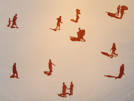
©2012 BUS/Ann-Kristin Källström, Walk on - Jamuhri Road - Just shadows II, collografi
Concrete art
Whatever one thinks of Bauhaus and Le Corbusier’s usual choice of material, it is durable. But it also offers softening aesthetic options. One of these in monumental sculpture could be seen in detail in Siri Derkert’s retrospective exhibition in 2011 at Moderna Museet and at Skissernas Museum in Lund. There, in some of her most striking works, Derkert carved reliefs and contours into large square slabs of concrete, partly while preparing for her large mural for Stockholm’s metro system.
Ann-Kristin Källström’s concrete graphic artwork, in which aspects of the form of a single photograph are transferred with some ingenuity into this medium, uses a more modern method, ‘graphic concrete’, developed in Sweden by Mikael Göransson. In her exhibition, five works are exhibited using this technique, two of them winter scenes of that mystical beautiful tree above (‘Only the weather is changing night/day’), and three smaller quadrants (‘Amaryllis I – III’). The two larger works were earlier displayed at the recent ‘5 +5’ exhibition in Örnsköldsvik and Eskilstuna, are remarkable in their pure and subtle form, and were arguably the most impressive work presented there. The smaller ones are also lighter, and suited for any surface area fit for placing art.
Africa
Africa has been called the Dark Continent and has associations with the darkest jungle, not least as a result of Joseph Conrad’s literary masterpiece. In 2011 and 2012, Ann-Kristin Källström made two extended trips to Kenya, which lies on the equator, and performed a nearly miraculous service for a group of local graphic artists there getting a large Domeij printing press moved across both a literal and a large bureaucratic ocean, from Sweden and Europe down around the Cape of Good Hope and back up to Mombasa and further up to Nairobi, which is somewhat protected from the scorching tropical heat by its altitude.
She also managed to take several thousand color photographs on location. Many of these were of ordinary people who could be seen below her home in Nairobi walking up or down a sandy road to or from their work or school in different directions, depending on time of day. In two photomontage works (‘Walk on – Jamuhri road I – II’), the artist has captured some of these people on their daily voyages before her camera.
In these works, individuals are set separately into the composition against a magnified image of the path they were navigating, blown up to show both the grain of the roadway itself and capture the fierce, desert-like sunlight on the sand. The effect of depth created by this ‘background as foreground’ is striking. The glimpse of a visually stark urban Africa created is one that no one, not even another artist, is likely to experience in person, but seems uncannily familiar. The same sense of being personally drawn close to her motif also arises from her use of color that absorbs light elsewhere. But in this case it is difficult to find a parallel to anything other than the antithesis of ‘Den sorte diamant’ as black hole that we began with, and a kind of solar fire spewing energy out into the surround instead.
What is perhaps most convincing about Ann-Kristin Källström’s art is that she produces impressive results with whatever method she chooses to employ and exhibit. This is not an accident but rather a consequence of the hard work that artists are always challenged with, but not always succeed in taking on. Her mastery of the techniques shown, and in both finding a form and in consciously reining in color, places her in good company with some of Sweden’s more celebrated artists of the past, and is a promising sign for her still coming work.
Text: Robert Järvellä
Foto: Jan K Persson
Volym 2012-04-01
![]()